
Tuesday, August 14, 2012
Wednesday, June 2, 2010
Magazine Cover
 This is a project that I had the most fun with. the point of this project is to show what one will be doing in 10 years, and it could me anything. I needed to put 3 teasers on it, a barcode, a title, the information (why I'm on the cover), my picture, and the date and volume 10 years into the future.
 I took a picture of myself in Graph Design class, an took out all the scratches and lines that I didn't want using the clone tool. Then I leveled the picture so that it looked the way I wanted it to. I then made a new project and put a blue bar on the side using the rectangle tool, and colored the sidebar according to the usual People Magazine outline. I also put a blue box on top of the main headline to show my name. I used the type tool for all the words on the cover. I looked up the People logo and put a gradient on it using the fx tool. Finally, I put in the barcode and I finished my project.
For the three teasers I leveled them and put them on the side bar and wrote something fresh about them.
Monday, May 24, 2010
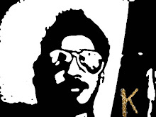
'Handsome' Guy

The point of this project is basically "employee of the month picture"
touch up. In this project, not only did I doubled up the picture, but I jumped the picture on the right so that there were two pictures on top of each other. Then, making sure I were in the top picture layer, I used the healing brush tool so that I could get rid of a lot of the wrinkles on his cheeks, around his eyes, and on his forehead. When I saw that they were gone, I used the quick mask tool and selected his teeth. Then I used the dodge tool to brighten up his teeth. When I felt that I was done, I set the accuracy of the top picture so that some of the wrinkles came back, but lighter, and his teeth were not unnaturally bright.
Crew
 This was one of the first projects that we used the least amount of tools posable but accomplished something amazing. The point of this project was to take out the ice burg and the boat in the back along with calm the water to make it look like a peaceful lake.
 In this project we first doubled up the picture so that we could show the difference in the pictures, a sort of "before and after" if you will. We then used the clone tool to take out the ice on the bottom left corner. We also used the clone tool to take out the boat in the back. We then used the patch tool to get rid of the wave in the back. We then used the Mask Type tool, picked a bulky font and typed crew. Then we went to fx, bevel and emboss, and pillow embossed it.
Family

The point of this project was to make it so it looks as fresh as possible. I had to remove all the dust and scratches, and fix the man sitting's nose, and take out the tape.
The first thing that I did was I doubled up the picture. Then I went into my history and took a snapshot of the doubled up picture and called it Focus. . I made sure I was in the new picture layer and I went to filter clicked noise and clicked on dust and scratches. I made it so that I couldn't see the dust anymore but the shape of the people was still there. I clicked ok when I thought it was good and took another snapshot of this, and called it blur. I clicked, and turned on blur but went back to Focus. Afterwards I used the art history brush and took out all the dust and scratches on the picture. I made sure that where it needed to be darker I set the brush to darken and where it needed to be lighter I made changed it to lighten.
After the dust and scratches I used the clone tool and cloned out all the tape in the picture. Finally I used the marquee tool to fix the man’s nose. I selected the nose on the other man (standing up) and jumped it to a new layer. I then dragged it onto the sitting man’s nose and erased the unneeded parts. I also put the occupancy down a bit so it blended in with the rest of the face.
Thursday, May 20, 2010
Zoo Postcard

This was, for me, one of the most hardest projects, even if it looks really simple. In this project there was a lot of experimentation with the canvas size. To make the border and the distance between all the pictures. What we had to do was have 1 big picture and 4 little ones (as you may have noticed),and to put them how they are. Well, in this project, there was a lot of thinking because this was also a test. You may not be able to tell this but there is more than one border around the pictures.
For the elephant I had to move the picture to the right and up, and put 4 borders around it to make it look as it does now ( black, white, another white, and black). I used the crop tool on all the pictures, but you can really tell on the four at the bottom. When I finally got all the work for the elephant done, they were easy. I just put a border around them, made sure I was in the right layer and put them together.
Finally I used the text tool to write all the facts down. I played around with the font and put a drop shadow on it using the "fx" button.
CD


In this project, I had to show the many things that make up a teenager's life. There was a lot of resizing done in this project, and many layers and masks were made.
For the title, the subheading and the words I used the text tool. Another place that I used the text tool was in the many designs that you see under the subhead and next to the cap. I used the marquee tool and many, many layers to make the different colored boxes that you see behind all the pictures.
For the pictures, I had to mask them. For some I used the quick mask tool and for others it was easier to just select the background then select the inverse.
The Ke$ha CD cover represents the new artists that are being discovered. The cell phone represents how people love to talk and text. The iPod represents the love for music and the new technology that is made every day. The glasses represent the new 3-D movies that are coming out. The cap, shoes, skinny jeans, and cardigan represent the fashion that people are into at the moment. Finally the headphones represent the love that people have for their music, and they are somewhat a fashion statement as well.
On the left is the front of the CD that we were to make. Point of this project was to take either an existing artist, video game, or whatever, and make a CD for what you picked. What I did with this project is I took the [best] game [in the world] Kingdom Hearts® and made it a rock CD.
For the front I put a city background I found on Google. I masked out Sora (middle), Donald (right), Goofy (left), and the guitar on Sora. Because I couldn't use the name Kingdom Hearts, I changed it to Rocker Hearts: Level 1, the lever 1 because it is the first CD. For the back I put a gradient as the background, and masked Kiri (bottom right) and put her where she is. I then put the heart shaped moon picture as the wallpaper and typed all the words, using the type tool, which were bosses from all the Kingdom Hearts games with a little difference. I also masked the microphone and wire to fit. Also if you look closely you can see the wire of the mike lace in and out of the words. The lacing I did in the layers by moving some above and some below the mike layer.
Commodities to Culture

In this project, I had to show the many things that make up a teenager's life. There was a lot of resizing done in this project, and many layers and masks were made.
For the title, the subheading and the words I used the text tool. Another place that I used the text tool was in the many designs that you see under the subhead and next to the cap. I used the marquee tool and many, many layers to make the different colored boxes that you see behind all the pictures.
For the pictures, I had to mask them. For some I used the quick mask tool and for others it was easier to just select the background then select the inverse.
The Ke$ha CD cover represents the new artists that are being discovered. The cell phone represents how people love to talk and text. The iPod represents the love for music and the new technology that is made every day. The glasses represent the new 3-D movies that are coming out. The cap, shoes, skinny jeans, and cardigan represent the fashion that people are into at the moment. Finally the headphones represent the love that people have for their music, and they are somewhat a fashion statement as well.
Dear Old Grandfather

In this project, we learned how to use many tools in photoshop. One of the tools that really helped us repair this photo was the clone tool. We used the clone tool to get rid of the obvious giant fold in the middle of the picture. Another place that we used the clone tool was on the reins of the horse.
Another tool that really helped make the photo look new was something called 'dust and scratches.' Dust and scratches gets rid of all the scratches on the picture with the help of the history tool.
The coloring of the picture was done one by one by the quick mask tool. We had to select all the things that we wanted to be the same color, save the selection, and color it by using the hugh and saturation button.
Tuesday, May 18, 2010
Jesus Christ Superstar

This is a project that my school asked the Graphic Designers to make, for a play production that we were having. Its called Jesus Christ Superstar (please do not feel offended). In this play Jesus is a girl in a band, and a raver, who pretends to be a boy. My project was one of the few that was picked to use as the poster for everyone to see, but unfortunately it was not picked.. :(.
In this project I used a lot of the stamps that i downloaded and about 3 different fonts. What I mostly used in this project was the stamps. If you look closely you can see about 8 different stamps. I also used the mask tool on the guitar so I only got the guitar and put a glow behind it.
Subscribe to:
Posts (Atom)